At a time when meteorological patterns have been altered by climate change (fueled by certain human activities), it’s not uncommon to hear heat is more intense nowadays, it rains less or more than anybody could remember. Whilst personal perceptions may not match reality, data gathered by several agencies show a more accurate picture and a well-documented answer to questions such as the ones we will post below.
We’ll be looking into a topic that’s close to our hearts here at Predictia – does it rain less than usual in Cantabria. We’re headquartered in Santander, Cantabria, a province known for its regular cloud cover, its nearly-daily rain and its green meadows. Rain is, therefore, a constant feature of both our personal and professional lives.
For this, we’ll be using the Regional State of the Climate (RSoTC) tool, a dashboard designed to explore in an open, accessible way practical information such as that delivered by State of the Climate reports, but at a local level. We’ve developed this tool thanks to the EU-funded OSCARS project.
So – is the general perception of less rainfall in Cantabria nowadays supported by data?
In-detail information
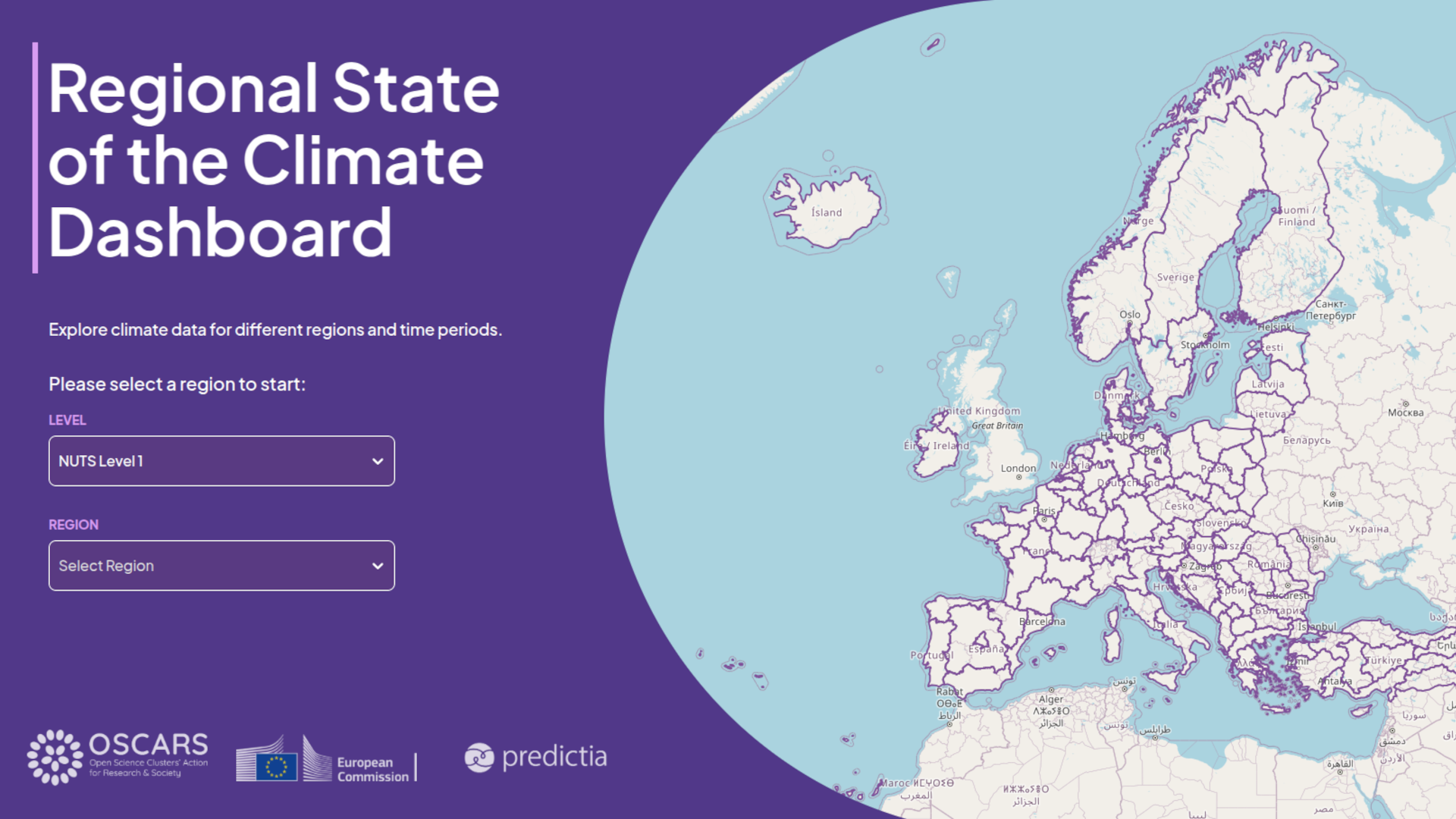
Let’s take a look at what happened in 2025, the most recent year with yearly data available. First, we need to go to the landing, regional selection page. The regions are divided according to the EU-defined Nomenclature of Territorial Units for Statistics (NUTS). Cantabria being a single province region is already featured from Level 2 (0 marks the largest unit, at country level).
Once it’s selected, the dashboard will show a summary where we’ll be able to find some hints.
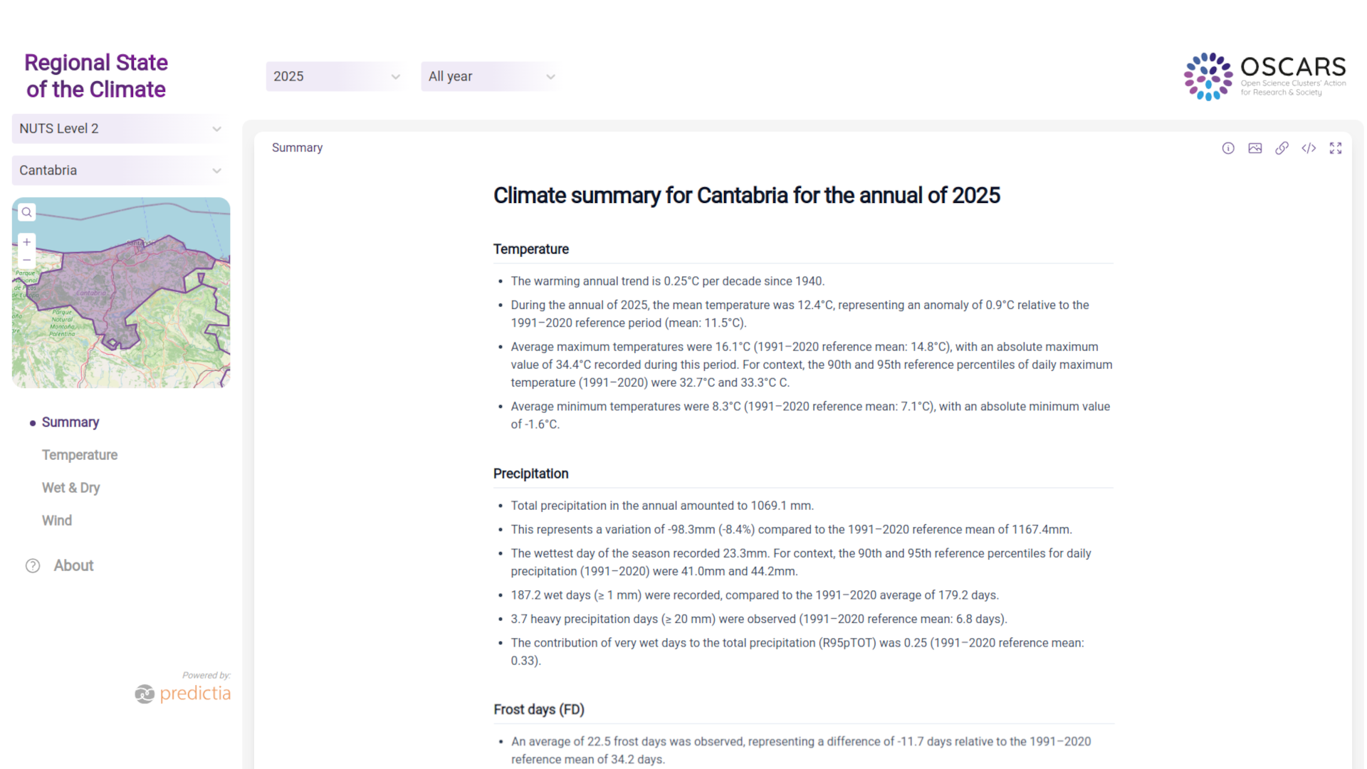
Our colleague Antonio Pérez, one of the researchers involved in the development of the dashboard, summarises the relevant data: total precipitation in 2025 was 1069.1 mm. This represents an anomaly of -98.3 mm (-8.4 %) compared to the average (1167.4 mm) of the reference period of 1991-2020. There are 187.2 days of ≥ 1 mm recorded, compared to the average of 179.2 days of the reference period (1991-2020). This could be translated as more rainy days over 2025, but less quantity. Besides, there were less extreme rainfall events (≥ 20 mm), as data show 3.7 such days, compared to 6.8 days in the reference period.
Does this mean it rains less than before? Our in-house meteorologist Markel García warns a trend can’t be confused with what happened last year. 2025 being a drier year compared to the reference period doesn’t automatically translate into “it rains less these days”. To solve that question we should compare longer periods of time. For now, our tool can provide information confirming 2025 was drier than the reference period.
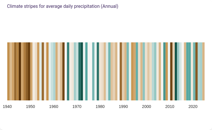
If we click on ‘Wet and Dry’ in the left-panel menu, you’ll see a series of precipitation figures displayed. These are related not only to last year’s precipitation in Cantabria records, but also to the evolution of these over several decades using graphs like the one below, inspired by Ed Hawkins’ climate stripes:
Let’s explore precipitation records now! Antonio suggests selecting NUTS3 level and Metropolitan Lisbon (Grande Lisboa) for some interesting precipitation figures, so let’s click on ‘Wet and Dry’. This first graph on display shows 2025 registered around 20 rain extremes.
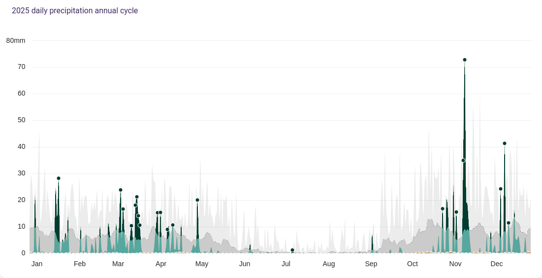
With this type of visualisation, records are easy to spot at a glance – each dark green dot on top of a precipitation spike. Hover the mouse over them and you’ll get detailed data such as date, total rainfall, percentile 10 and 90 and historical maximum and minimum of the day. The eyecatching November 13, 2025 was a particularly rainy day, well above all other 2025 rainfall records with its 72.91mm.
A noticeable trend
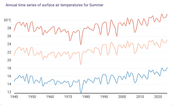
Let’s take a look now at temperature, where trends are easier to observe compared to precipitation, where there’s lots of variability with drier and wetter periods as seen before. We’ll travel to the region of Madrid, where the summary points out the area has been warming at a rate of 0.29ºC per decade. On the top dropdown menus, select 'Summer' instead of the by-default ‘All Year’ and see the summary stating this season is particularly sensitive to global warming with a growth of 0.33ºC/decade – or almost 1ºC every 30 years since 1940.
How is this visualised in the different graphs displayed in the ‘Temperature’ section? One of the first images shown is a surface air temperature time series, the one you can see below this paragraph, where you can notice average maximum, mean and minimum temperatures have clearly risen since 1940. Let’s take the average minimum in summer, for instance – it goes from a 14-16ºC range to jumping above the 18ºC threshold a couple of times in recent years.
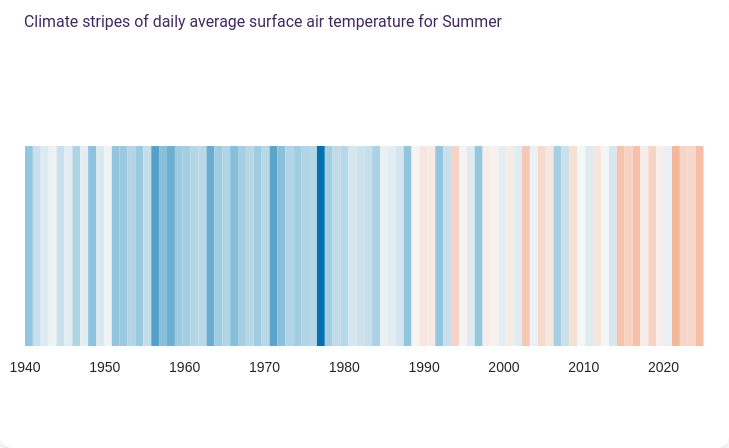
The variation from predominantly blue to more frequent reddish in the climate stripes below show how mean temperatures have risen in the Madrid region in summer.
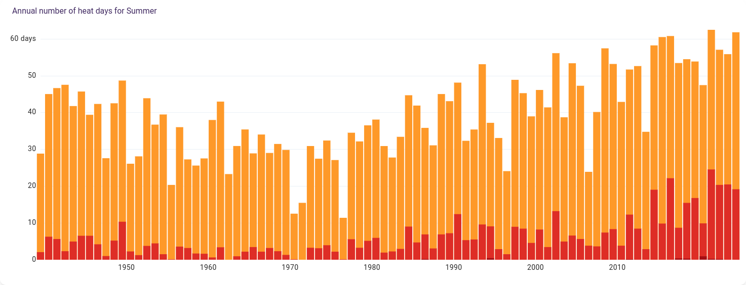
Then at the bottom of the page, you’ll find the following graph of the number of hot days (>30ºC) and very hot days (>35ºC). It wasn’t until the mid-90's when the number of hot days went above 50 per year (53 in 1994) and the extremely hot days (>40ºC) started happening (1995). Over the past few years, it’s not uncommon to go above 60 hot days per year, very hot days are around 20 per year and extremely hot days are gaining ground.
Do you have any other queries? Are you worried about tropical nights (>25ºC) being on the rise? You may keep exploring our tool in this link.
In case you want more information about the dashboard technical aspects and its contributions you can visit the project page on our website.
And should you want to develop tools like this one and need a reliable partner for your project, you can reach out to our team via email at predictia@predictia.es or via any other means available at our Contact section.