A FAIR and reproducible dashboard
Global and continental state of the climate reports do not typically follow FAIR principles (to be easily findable, accessible, interoperable and reusable) and despite data tend to be open, code and algorithms used for downloading and processing are not, which hinders ir reproducibility.
Our dashboard strictly follows the FAIR principles and so does its design so that it can be reproduced in other regions of the planet.
This way, we’re trying to promote the creation of state of the climate reports at the regional levels we offer in our tool.
Several regional and temporal dimensions
The dashboard features four different geographical levels, based on the EU-defined nomenclature for territorial units for statistics (NUTS):
- Level 3: small regions.
- Level 2: basic regions.
- Level 1: major socio-economic regions.
- Level 0: countries.
That regarding territory, but how about temporal dimensions? The top dropdown menus allow users to select a particular year (from 2016 to present), and also the season of the year, and even a particular month.
Furthermore, there is information displayed in text format as a summary, detailing trends, averages and anomalies in regions and periods selected for a series of indicators.
The tool provides the same information with the same graphs for each of these geographical and temporal levels with the ultimate goal of reaching the final users’ analysis dimension, according to their needs.
Adapted graphs
Among the many charts shown in the RSOTC dashboard, two of them are adapted from excellent data visualisation ideas:
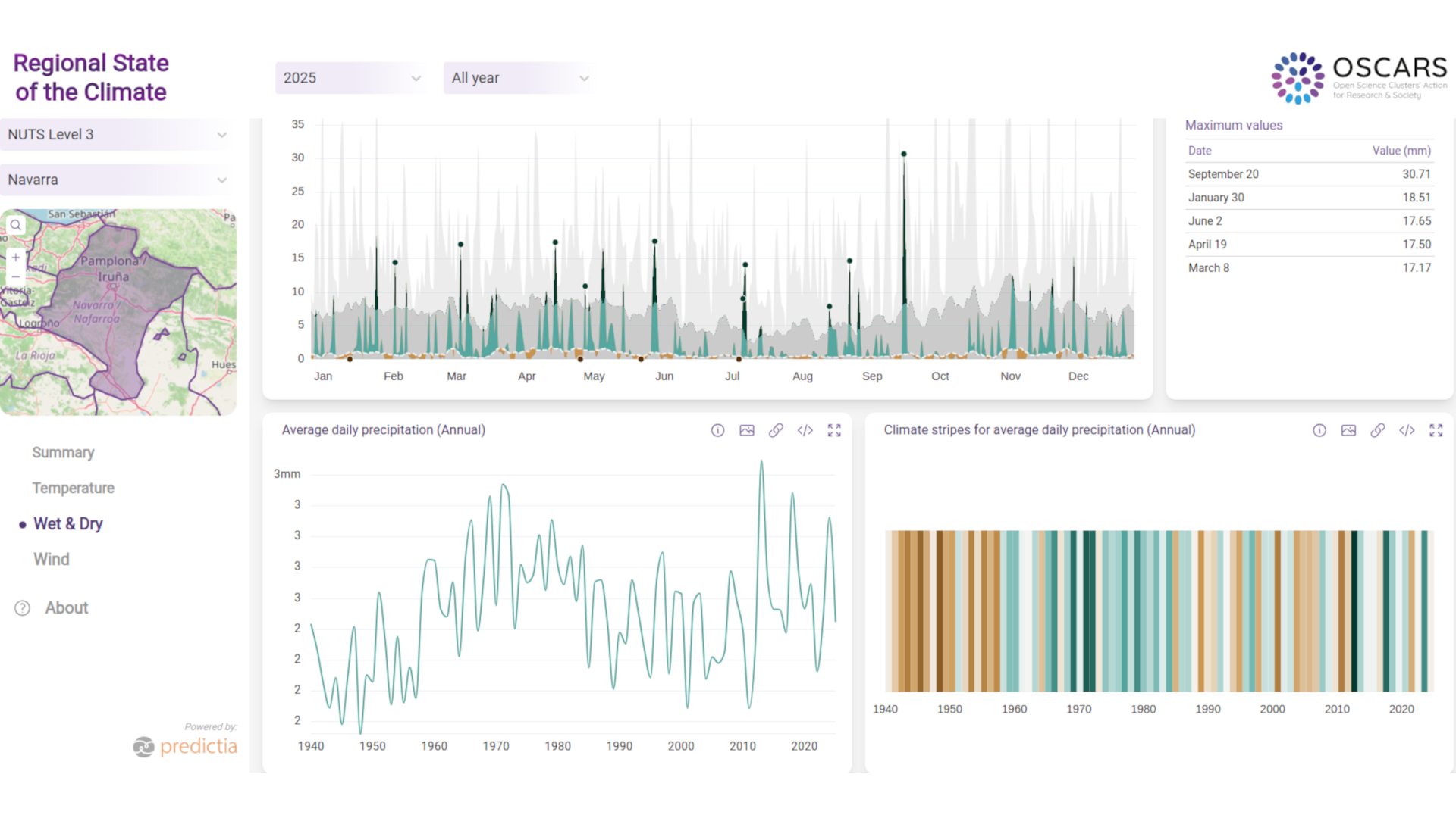
- Ed Hawkings’ Climate Stripes, which we applied not only to yearly surface air temperature as in the case of the original stripes, but expanded them to reflect the evolution of rainfall and wind too.
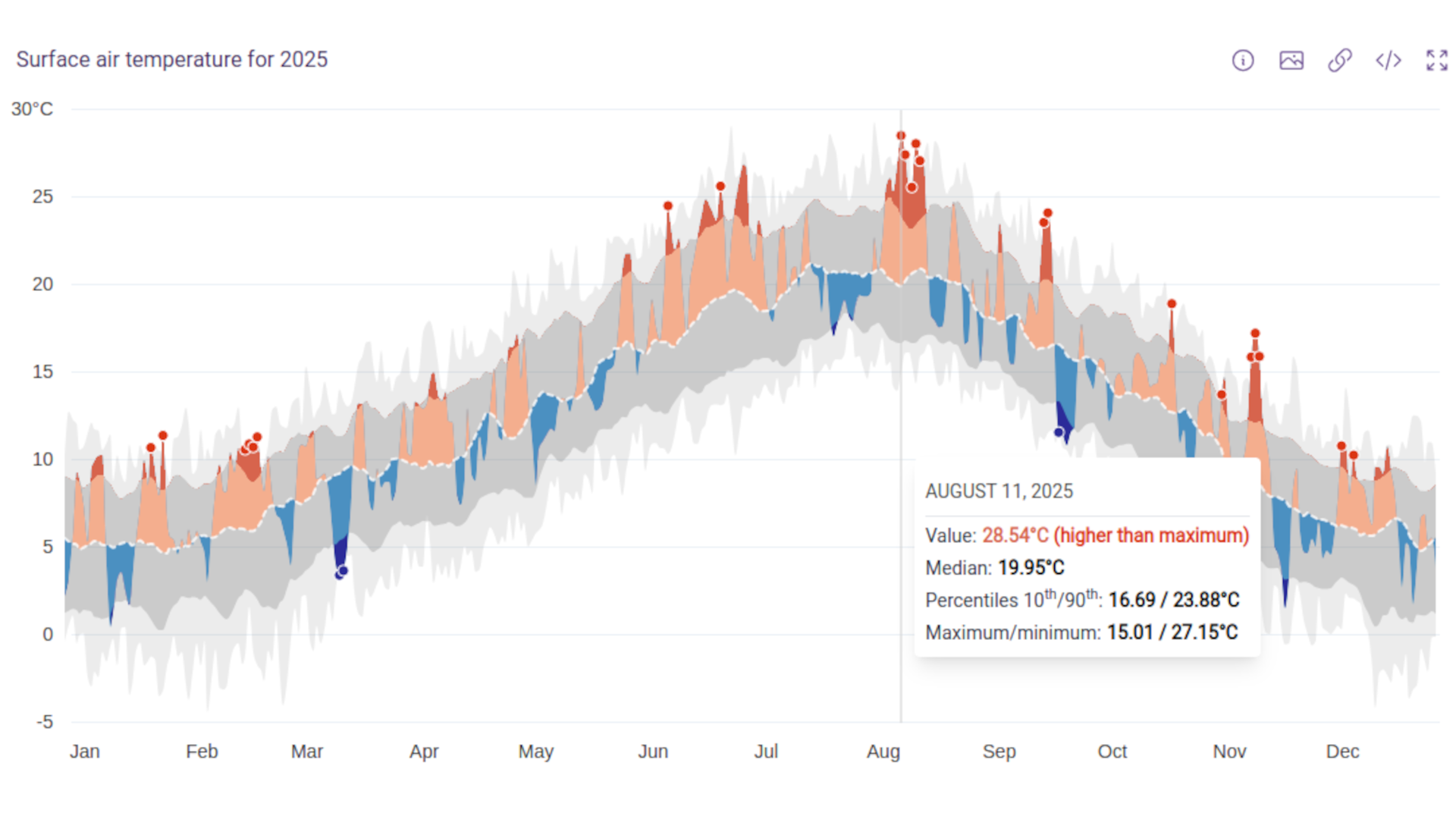
- The average daily mean chart of surface air temperature created by created by Copernicus Climate Change Service, has also been adapted with minor variations to rainfall and wind variables.
This graph allows users to find anomalies compared to the reference period at a glance.