Earlier this month, the Carlos III Health Institute's National Center for Epidemiology published the COVID Atlas we developed for them. It's an interactive tool that allows users to explore what happened in Spain during the seven waves of the COVID-19 pandemic between the beginning of 2020 and mid-2023.
Furthermore, it showcases the data in an extraordinary level of detail, as the data (which we also took care of processing) refer to both municipalities and even post codes in the case of cities with a population over half a million inhabitants.
How to explore it?
First things first – You can access it here. Now, we’ll provide some clues on how to use it.
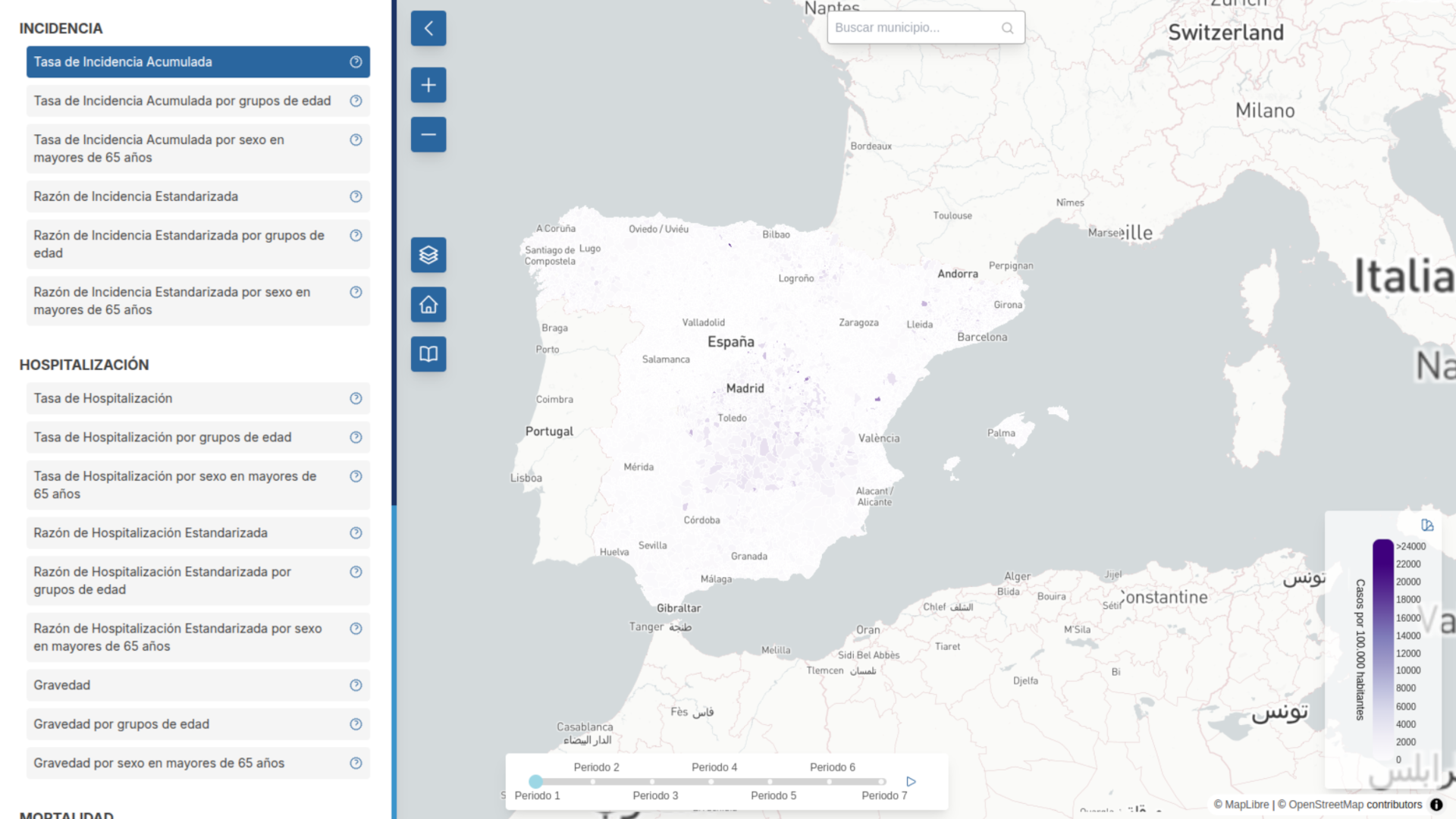
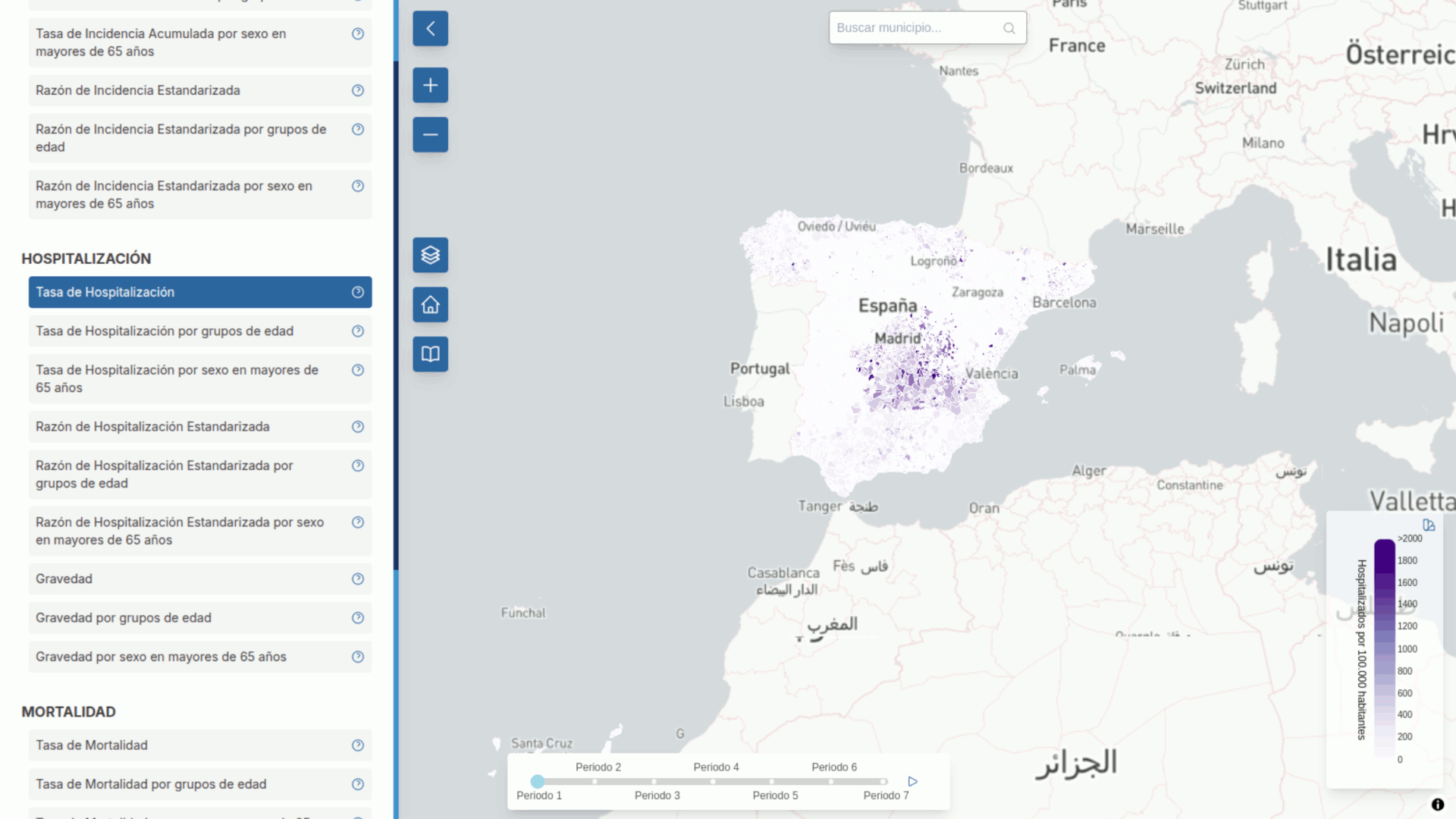
Once you’re in, the Accumulated Incidence Rate appears selected by default on the column in the left, as it’s the first one among the 25 variables available. As you can see, some of the epidemiological parameters are also disaggregated by age group and gender, in the case of the above-65-years-old population.
In the center-bottom part of the Atlas, you can see a slider showing the seven waves that the COVID pandemic comprised in Spain. You can slide it to see how the map changes to show the relevant data accordingly.
Besides, you can set up the color scale to match your preferences in the top-right part of the colour scale, shown in the bottom-right part of the screen.
And when it comes to selecting towns, you can either browse the map to find them or type the name in the search area placed in the top-center part of the screen.
Understanding the data
Let’s say we’d like to check the Mortality Rate in Corral de Almaguer, a village in the province of Toledo, in Castilla-La Mancha.
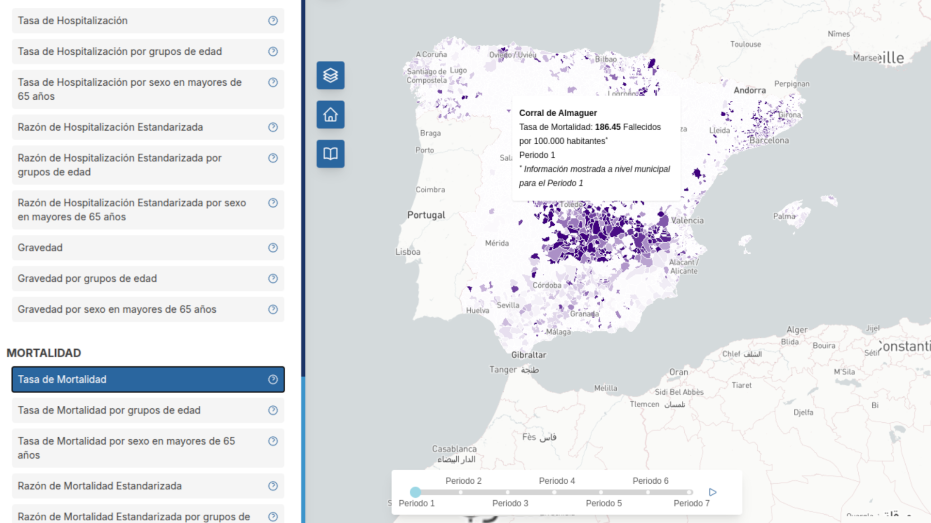
If you place the mouse over the town with Period 1 pre-selected by default, it will show this town had a Mortality Rate of 186,45 deaths for each 100.000 inhabitants.
When you click on the town area, the Atlas will take you to the following image, showing the evolution of the variable over the seven pandemic waves:
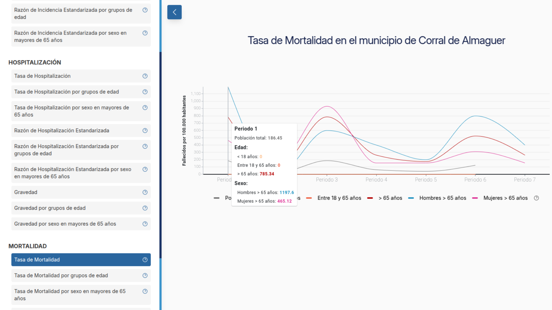
If you place the pointer over the different periods shown, a box will appear showing disaggregated data for age groups and gender (for 65+ year olds only).
In the case of the image above this paragraph we can see that in Corral de Almaguer the Mortality Rate rises to 785,34/100,000 when narrowed down exclusively to the 65+ population segment. But if we browse by gender, the rate rises further to 1176 deaths for every 100,000 over-65-year-old men and 465,12/100,000 for women in the same age range.
When placing the mouse over any of the age groups in the horizontal axis, the one selected with be shown more prominently.
Despite towns and villages like Corral de Almaguer –as it’s the case for most towns in Spain– is far from the 100,000 population mark, this way of measuring is broadly used to standarise data and compare places with a huge difference in terms of inhabitants. It’s general practice in public health, says our colleague Antonio Cuadrado, one of the persons in charge of this project.
Once we’re browsing the graphs in one town, we can select any other variables in the left menu, such as Standarised Hospitalisation Ratio, shown below.
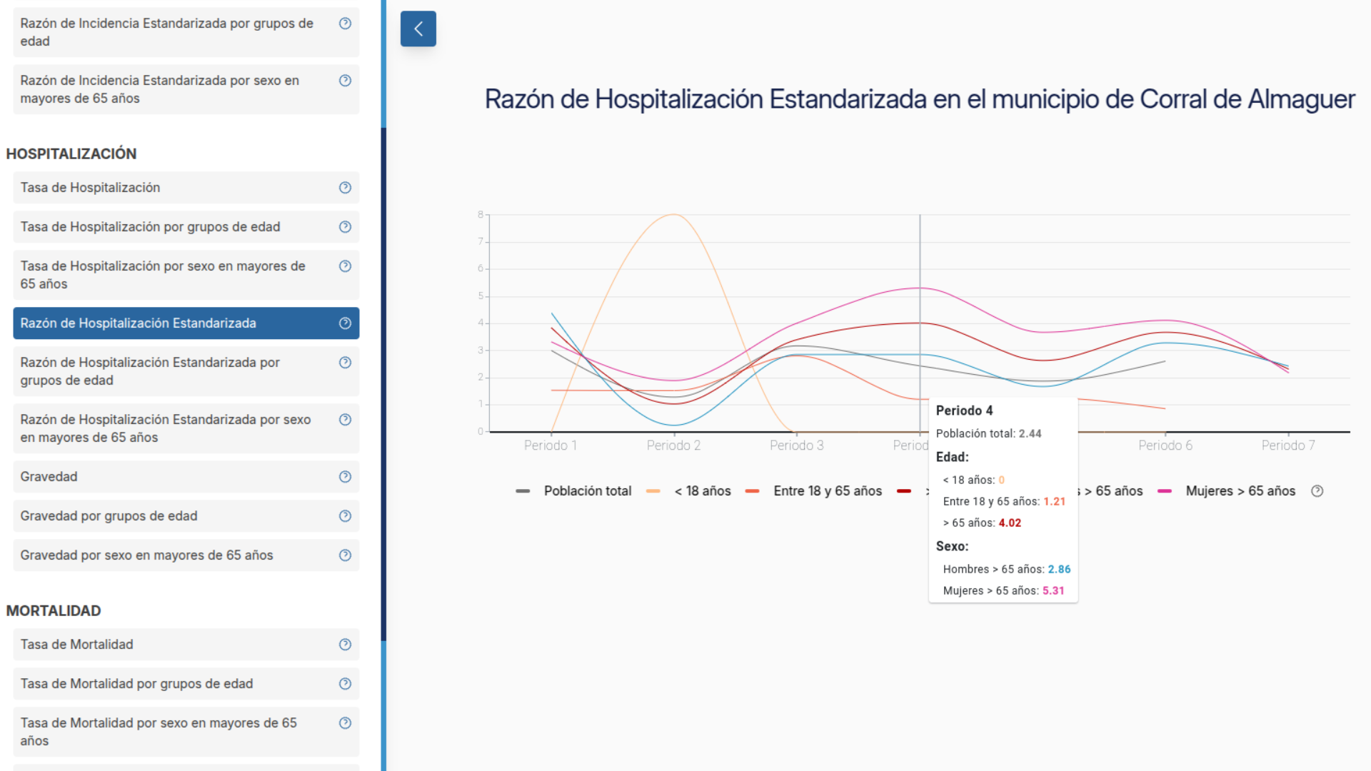
In this case, as in the case of the other Ratios available, the vertical axis shows the deviation or conformity to the average in the rest of the country – “1” being the average –. This information is also further explained in the help section for each index, when placing the mouse on the question mark (see image below).
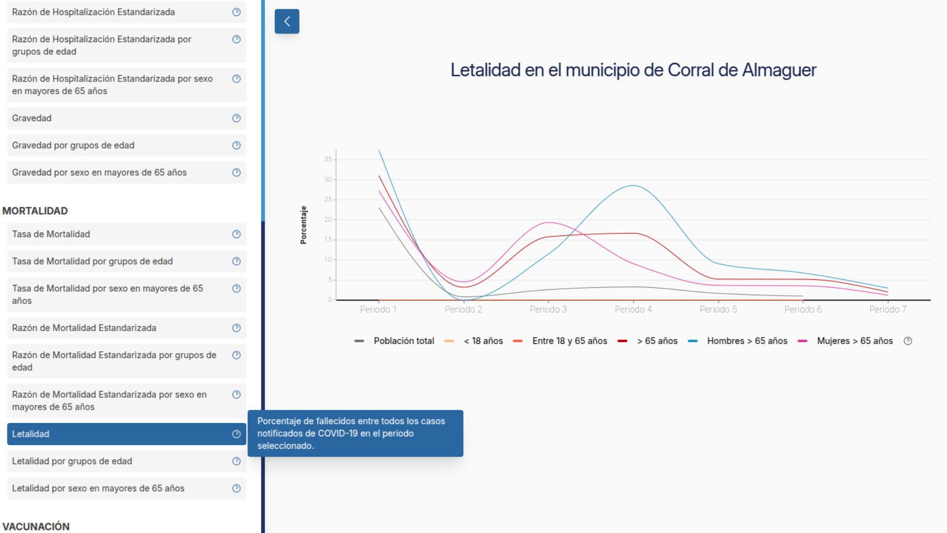
For epidemiological parameters such as Lethality or Seriousness, the percentage for each population segment is shown.
Where are all these data coming from?
As explained by the Carlos III Health Institute's National Center for Epidemiology through a press release when launching the Atlas, “all information regarding incidence, hospitalisation and mortality because of COVID-19 [...] are drawn from the regional epidemiological surveys each region fills when identifying a new case [...]. Data on vaccination coverage has been obtained from the vaccination register created during the COVID-19 pandemic for monitoring COVID-19 vaccination, handled by the Ministry of Health”.
However, it’s important to take into account the notice the National Center for Epidemiology added in that same press release:
The interpretation of the data requires certain caution, as there may be limitations related to the notifications, the evolution of the information gathered and the bias that small villages may show, among others.
If you’d like to know more about the COVID Atlas, there’s a more technical and in-detail description here.
And should you need visualisation tools such as this one for your project, don’t hesitate to reach out to our team via predictia@predictia.es.