Key Colours
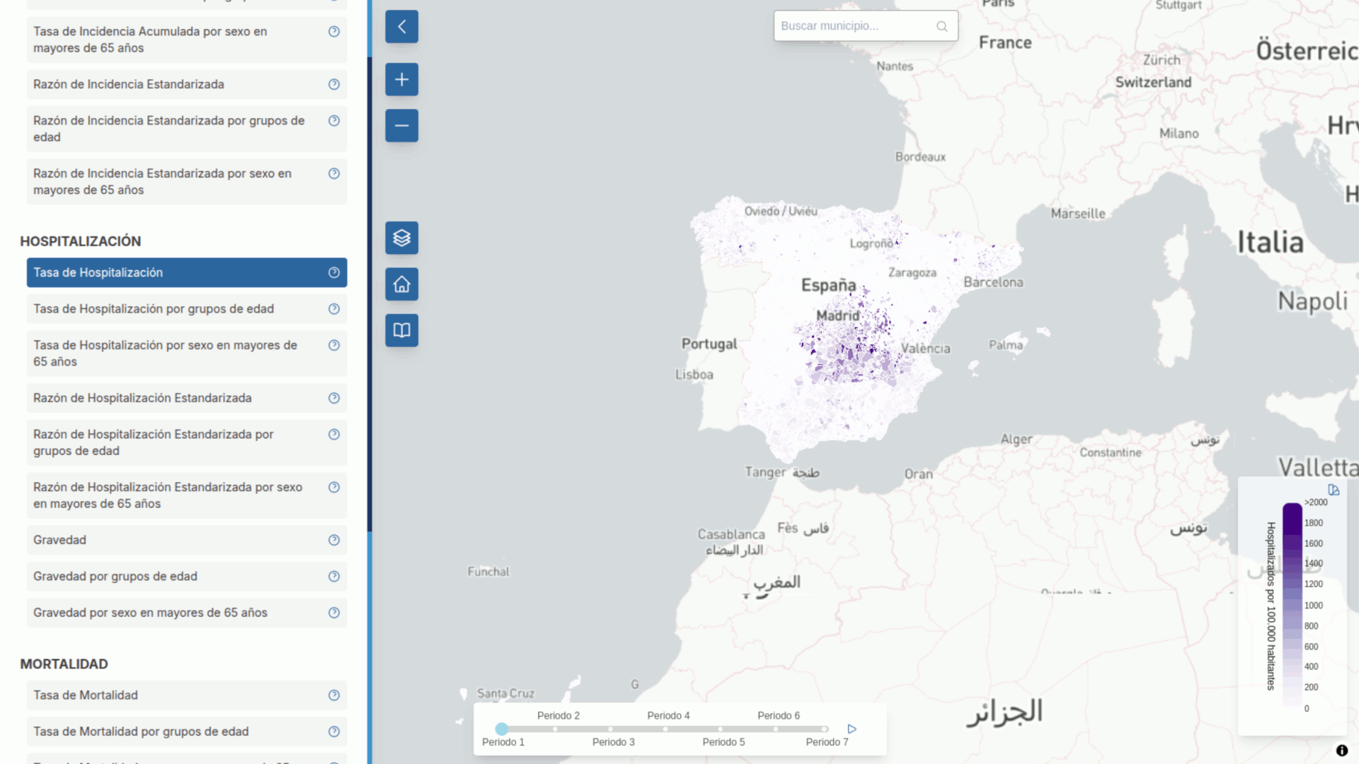
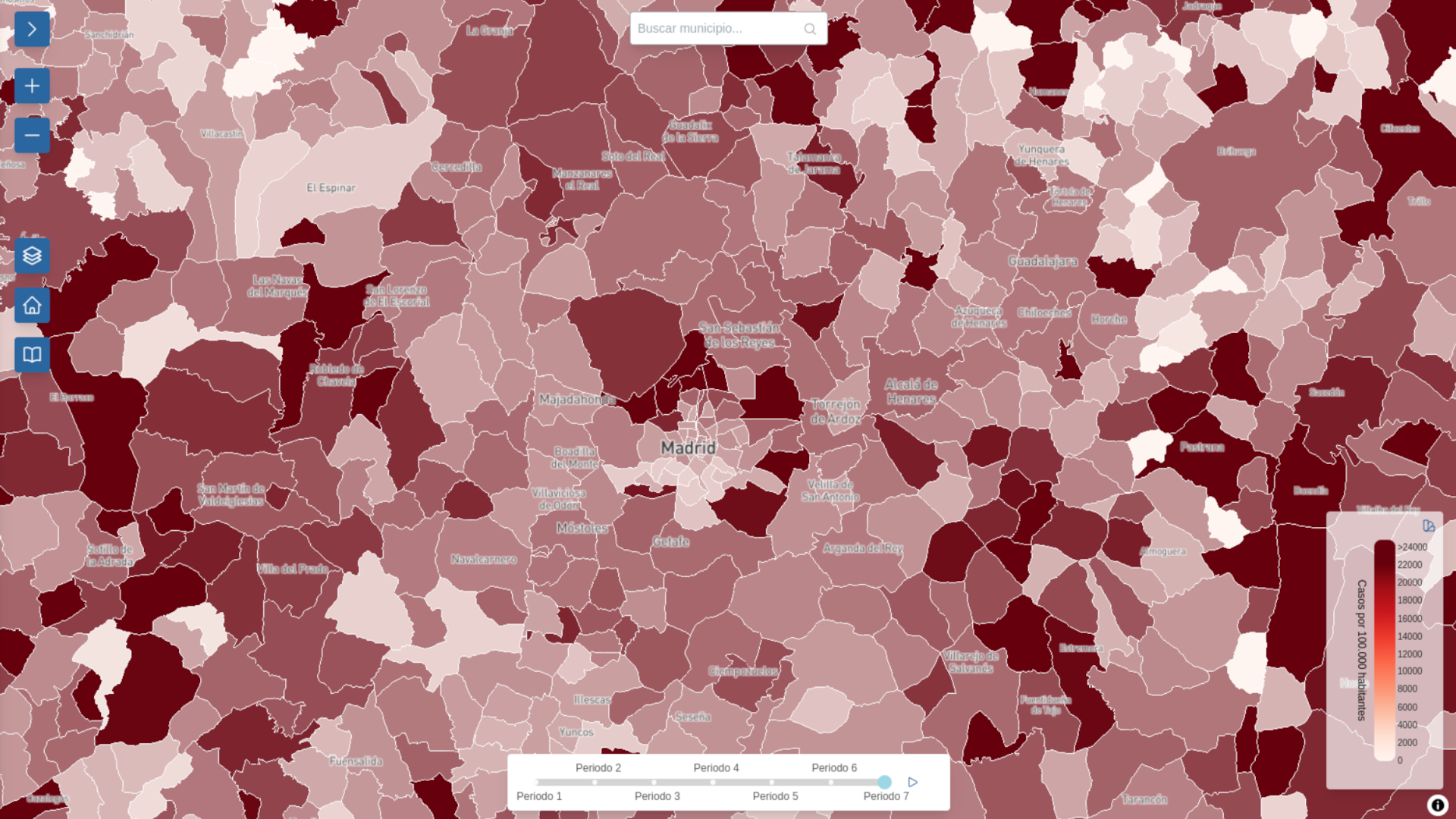
The COVID Atlas allows users to analyse the information both spatially and temporally. The spatial dimension can be explored through choropleth maps where the colour of each municipality or postcode corresponds to a value of the magnitude represented. Furthermore, users can analyse the evolution of these magnitudes over different periods through temporal graphs.
The user can select the colour scheme used in the choropleth maps from those proposed by Cynthia Brewer. This cartographer proposed a collection of colour schemes designed for data visualisation with the main goal of being perceptually effective and accessible, meaning they are easy to distinguish for people with different degrees of colour blindness. These palettes are widely used in mapping, data analysis and any discipline requiring visual representation of information, as they facilitate the understanding of patterns and trends in data.
Depending on the selected magnitude, sequential or divergent colour palettes are offered. Sequential palettes are used for magnitudes ranging from low to high values (e.g. mortality rate) and the colours vary in brightness, often a single tone from light to dark, or from light to dark with a slight change in tone. On the other hand, diverging palettes are provided for data that have a significant midpoint and extend in two directions (e.g. standardised incidence ratios). In this case, two different colours diverging from a central neutral colour, typically white, are used.
Improved user experience thanks to a vector mosaic
One of the goals in designing the Atlas user interface was to provide an optimal user experience. User experience refers to the perception a user has when interacting with a product or service, including its usability, visual design and technical performance. It is key to the success of any digital product, as it influences the users' satisfaction and willingness to continue using the product or service.
In order to improve usability, it was decided to develop interactive maps and graphs so that users could check the displayed values by simply placing the mouse over them. This was the reason behind using a technology that would allow the maps to be drawn directly in the browser – The server transfers data to the browser instead of images, as it generally happens in Geographic Information Systems (GIS) using standards such as the Web Map Service (WMS) from the Open Geospatial Consortium (OGC).
In the case of the COVID Atlas, the data consists of the definition of polygons (e.g. municipalities or postcodes) and the associated magnitudes. However, the geographical detail of postcodes makes it necessary to simplify their representation when visualising large geographical territories. Otherwise, the volume of information transferred from the server to the user’s computer would negatively affect the performance (and therefore, the usability) of the product.
To address this simplification, we decided to use vector tiles. Vector tiles are an efficient way of handling geospatial data in web applications by containing the information in vector format instead of static images. This means the app only needs to download the geometric data and its attributes, which greatly reduces the amount of information being transferred, thus speeding up map loading and improving the overall user experience.
In addition, because these data are vectors, the map can scale and adapt to any zoom level without losing quality or becoming blurry, which is often the case with raster graphics. This is especially useful for devices with high-resolution displays or when the map detail is greatly zoomed in.
One more advantage is that vector tiles allow customising the style of the map directly from the browser, without the need to generate new images for each little adjustment. This facilitates the creation of more dynamic maps adapted to different needs or contexts, such as changing colours or highlighting specific elements as it generally happens when users interact with it.
And last but not least, these vector data-based tiles allow advanced interactivity, such as selecting, filtering or animating map elements with more accuracy and flexibility than traditional images.
Documentation
The libraries used for the technical implementation of the COVID Atlas are shown below:
- React has been used as the base library for the implementation of the interface.
- MapLibre has been used to visualise maps and process the geospatial information.
- Google Protobufs (PBF) has been the data format used to generate the vector tiles.
- The VisX library was used to generate time series graphs.
- The Tailwind CSS library was used to implement the design, which is responsive to different screen sizes.