An overview of all possible climate futures is just a click away. That is what the IPCC Interactive Atlas allows. We were part of the IPCC Atlas team, implementing the technical aspects of this website. This involved front-end and back-end development, data processing, quality assurance and a close co-development with IPCC authors and contributors. In total, the Atlas provides access to 27 datasets (global and regional), with 30 climate variables and derived indices.
The Interactive Atlas was accessed by 445,000 users in the first week after its launch on 9 August 2021 and currently has a steady flow of around 2,500 users per day. It is based on open source tools, and technical details can be found here.
Thanks to our previous collaboration with IFCA-CSIC, we both already had a good starting point: the Climate Scenarios Viewer we developed for the Spanish Platform for Climate Change Adaptation. However, the development of the Interactive Atlas was a much bigger endeavour, comprising a whole team of over 100 people in the IPCC—the Atlas team. So, we want to tell the story behind its development in a series of posts. In this first post, we’ll give a general overview of the Atlas: main functionalities, barriers we found along the way and so on. And on future posts, we’ll dive into the more juicy, technical details.
Regional climate information, filtered through different prisms
Formed by climate change researchers, the IPCC task is to distill all of the information about climate change and make it available to policy makers and citizens all over the world. The Interactive Atlas is a novel tool from the first Working Group, the one dealing with the physical basis of climate change. As such, the Atlas comprises:
- Global climate models: in particular, data coming from the Coupled Model Intercomparison Project —both phases 5 and 6 (CMIP5 and CMIP6). CMIP is a collaborative framework designed to improve knowledge of climate change, that provides multi-model climate change projections at a worldwide scale. It also includes paleoclimatic data (PMIP4 and 5).
- Regional climate models: to look at a regional scale, CORDEX downscales the data from global climate models down to different regions. In the Atlas, we make available all the different CORDEX domains (Europa, Africa, Antarctica and so on). Overall, this translates into more than 100 climate simulations across different geographical regions.
- Climate observations: historical meteorological records with global or regional coverage are distributed across many different repositories. Therefore, the Atlas team decided to integrate data coming from multiple sources of meteorological records: Berkeley Earth or CRU TS. It also includes reanalysis: a numerical description of the recent climate, produced by combining models with observations. In this case, the Atlas includes datasets like ERA5, from the Copernicus Climate Change Service.
- Variables and derived indices: Over 25 different climate indices can be consulted in the Atlas. From general variables like mean temperature or precipitation, to sector-specific indicators like heating degree days, or climate drivers like population and anthropogenic CO2 emissions.
- Timelines and reference periods: when exploring future climate change scenarios, it is important to have well-defined baselines to compare against. The Atlas allows the user to select among 5 different periods as baselines: from pre-industrial levels (1850-1900), to recent climatological periods (1995-2014).
- Custom seasons: although most of us are used to the typical seasons (spring, summer, autumn and winter), some weather phenomena exhibit their own “seasons”. That’s the case for monsoons, that exhibit periodic variations across different parts of the world. To take this into account, the tool lets you select predefined seasons, or build your own.
Many people, each one of them with their own background and profile, look towards the IPCC for climate information. For this reason, the data in the Atlas needed to be as far-reaching as possible, catering to the informational needs of different fields: agriculture, city planning, energy, societal impacts… and others. This made sure that the variables and indices were relevant for the sectoral applications developed by the Working Group II, working on climate change impacts. This set of features covers most of the user needs that came up during the pre-development and development process. And it was agreed upon after many rounds of discussions within the Atlas team at the IPCC.
Data management and Quality Assurance: a crucial task, often invisible
Overall, processing and curating the datasets in the Interactive Atlas has taken over 1.5 million hours of computing (yes, we kept tabs). This is 171 years of computing time, executed in parallel. This process was undertaken jointly between the Atlas team, through the infrastructure maintained by IFCA. This was a time -and resource- consuming task, split into several steps:
- Acquiring the information: the team downloaded the datasets from ESGF. Although the original datasets had daily resolution, the team aggregated them into monthly resolution, to guarantee an easier handling.
- Homogenising the information: to allow for intercomparison within the Atlas, each one of the datasets needed to be adjusted to fit a common grid. This was done following appropriate interpolation techniques through a process that takes into account the different projections for each dataset, and other particularities of the data sources. These particularities include dealing with nuances like leap and no-leap years.
- Quality Assurance: a thorough curation of the data was undertaken, controlling the models for outliers and taking into account different inhomogeneities in the model outputs.
- Leaving the information in an actionable format: some of the user needs required additional work on how to handle the datasets, to provide an usable download format for the data, such as GeoTIFF or netCDF.
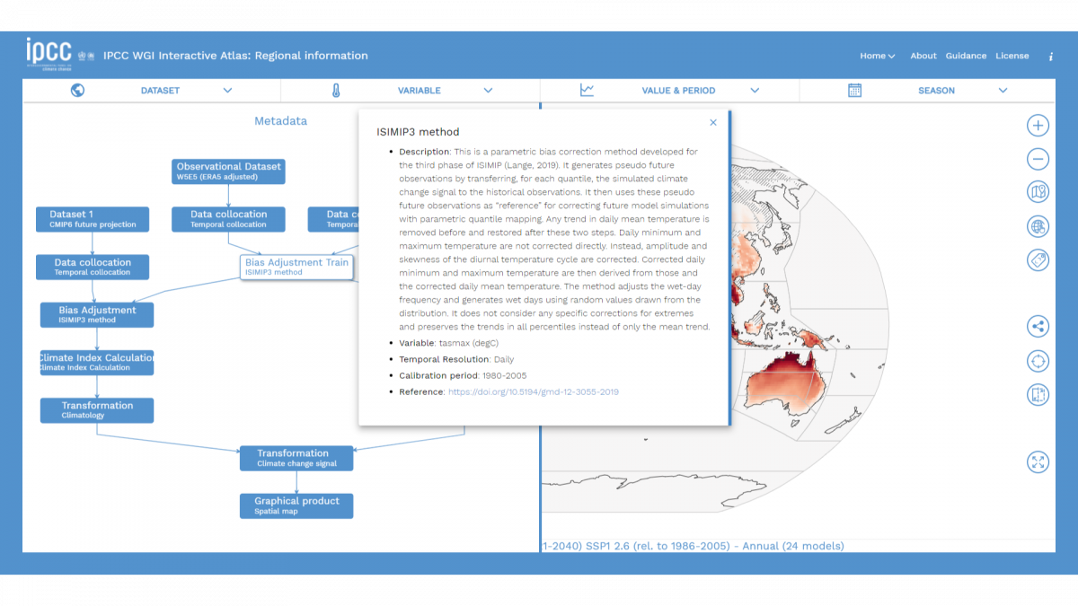
As a result, over 100 TBs of initial information were distilled down to a total of 1 TB of data, that is the total size of the data handled by the Interactive Atlas. To keep track of this whole process, all of the data available in the Interactive Atlas is accompanied by its corresponding metadata, that details the post-processing it went under. The standard format for this is Metaclip: a language-independent framework to keep track of climate products provenance. This ensures the transparency and accountability of the whole process.
From communicating uncertainty to accessibility: relevant details in data visualisation
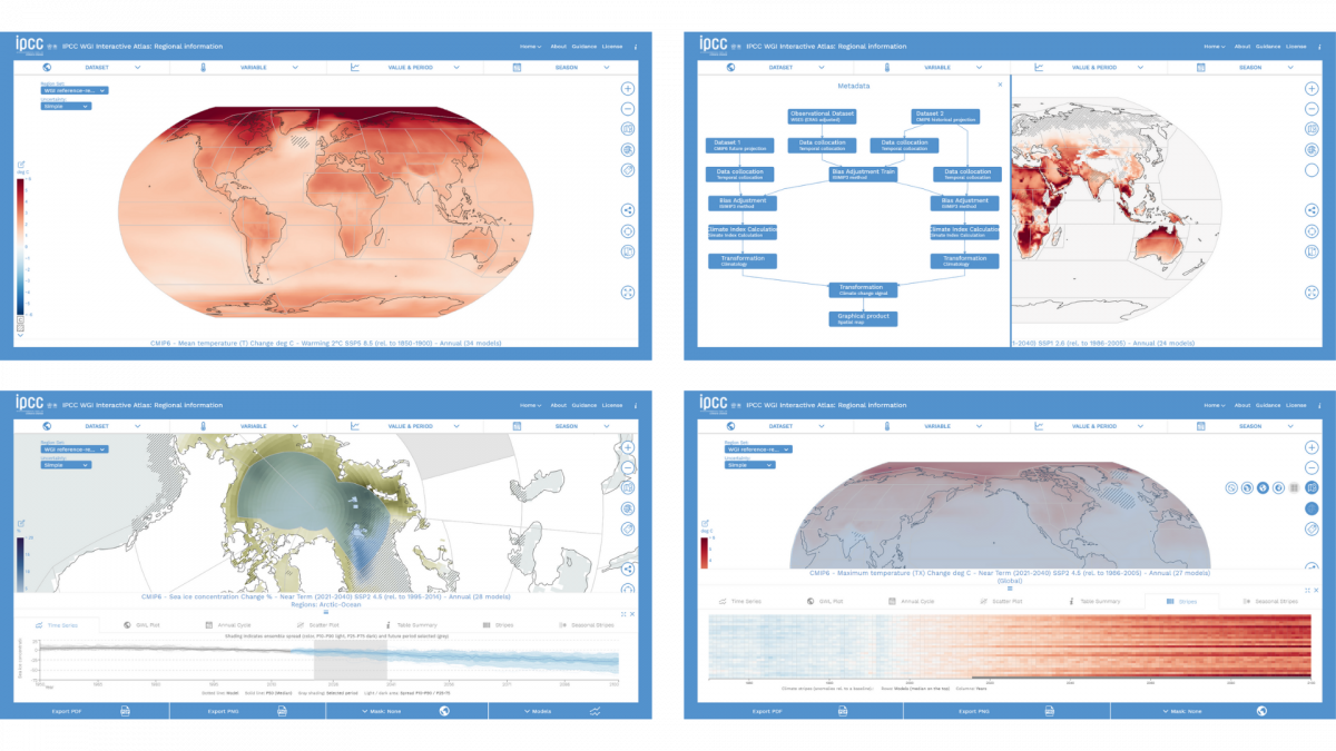
As important as the data itself is how we present it into the world. On the Interactive Atlas you will see a wide range of data visualisations: from classic climate change choropleths, to time series and climate stripes. One of the key worries of the Atlas team all throughout was how to ingrain the uncertainty of climate models into the visualisations. The first evident approach to communicating uncertainty is hatching: using parallel and crossed lines to mark out the areas of the map where the signal of the climate models is uncertain. And the Atlas provides two types of hatching:
- Simple: linear hatching that covers the areas of the map where there is low model agreement.
- Advanced: linear hatching is used to mark areas where there is no change or no robust signal, while cross hatching is used to cover areas where the models have conflicting signals.
In other visualisations, like the time series, uncertainty translates into plotting the whole ensemble of models, instead of just their mean, and shading in grey the periods of time where a global certain temperature (1.5 ºC, 2ºC) is reached.
The uncertainty communication is sprinkled throughout the broad variety of visualisations included in the Atlas. Climate stripes, seasonal climate stripes, Global Warming Levels… we wanted to offer a variety of visualisations, to explore different aspects of the data, and reach the different needs of the users. And to tackle this variety of needs, a tool like the Atlas has to keep accessibility in the middle of the design process. Between 5 and 10% of the world population is colour-blind. Users that are mobility-impaired, or vision-impaired and unable to see clickable elements in the page, rely on keyboard navigation. And we have kept all of this in mind. The colour palettes were discussed with the IPCC, to be colour-blind safe, and the tool is fully keyboard-navigable. In addition, our team at Predictia made sure that the interactive elements are supported by screen readers.
Fast response times and big datasets: a challenge
In the Atlas, front- and back-end come together to offer a comfortable User Experience. The interface feels swift, with fast response times. This is thanks to the pre-calculations done first, during the data curation process. The combination of huge datasets and the many options for data selection (different baseline periods and the customisable seasons) forced us to precalculate all the different combinations of data, to serve them quicker to the front-end. This extra effort paid off, with fast response times that retrieve the data usually in under 0.5 seconds. Another challenge was the information design for the Atlas. Historical observations, climate projections under many different climate change scenarios, customisation options… The Atlas team had to juggle many different aspects, and in the end we were able to endup with a user interface in which no feature is more than 3-clicks away, while keeping a clean design.
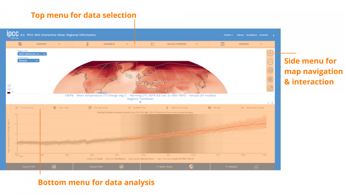
This interface design also helped us avoid information overload. How? By keeping three differentiated spaces for interaction in the interface:
- Top menu: data selection
- Right icon menu: data navigation and sharing
- Bottom menu: to dive into data analysis and visualisation
In this way, the Atlas lets the user follow an information funnel that provides more information as they go along the process, instead of offering all the information at once.
Enabling team work: the best path to revisions
The co-development of a project such as the interactive Atlas requires adaptable project management. On our side, for the technical implementation, we followed Agile methodologies, to respond to the quickly changing requirements of the process. This allowed us to attune our development rhythm at Predictia to the internal processes of both the Atlas team and the IPCC timeline. Throughout the whole process of development and revision by the IPCC, over 1000 Github issues were opened—and solved.
One of the small but important feature of the Interactive Atlas, that eased the debugging and the development of the Atlas is the following: when you navigate and interact with the website, you’ll see that the URL changes. If you copy-paste this URL and share it with someone, they will be able to see exactly what you’re seeing. By providing a unique URL, the debugging and user needs gathering was made much more quickly. And now, this approach has stayed in the final version of the Atlas, as a permalink feature.
Technical aspects
If you are interested in the technical aspects and the software components that are behind the Interactive Atlas you can visit this specific blog post on our website.
Total transparency & reusable data
In this new cycle, the IPCC promoted transparency and reproducibility . And that is tied to following FAIR principles: making everything Findable, Accessible, Interoperable and Reusable. A big stress was put into the reusable, so the Atlas team made additional Jupyter notebooks available at their Github repository. Together, the Atlas team developed the Interactive Atlas. Now it’s time for you to use it!