
A month ago, the final version of the Interactive Atlas of the IPCC was unveiled. Now that the dust has settled, we want to provide a peek into the technicalities behind its implementation. After all, we learnt some lessons after processing hundreds of TBs (with over 1.5 million hours of computing time) that we want to share with you. This will be a long post, so we have splitted it up into some sections, for those of you that are interested in some specific aspects:
Building upon Open Source
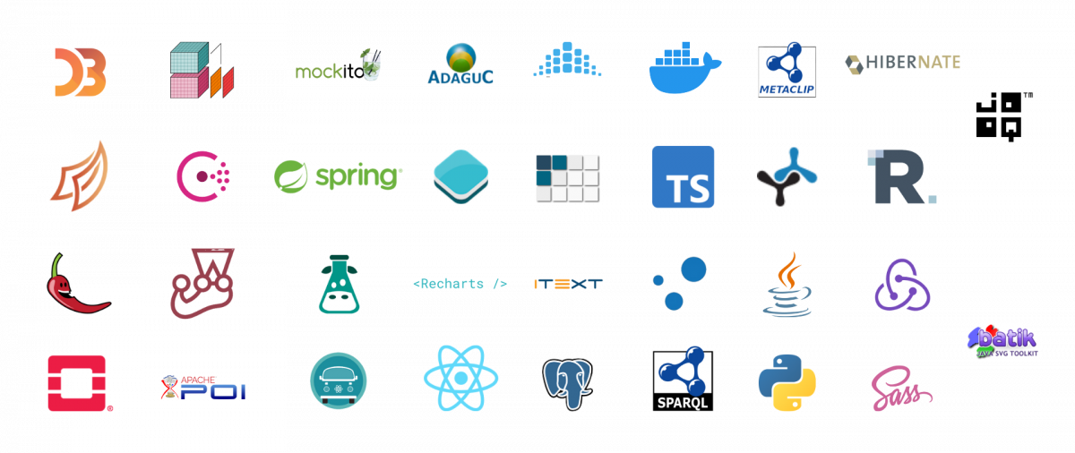
Technological stack for the Interactive IPCC Atlas
If you look at the stack of technologies on the image, you’ll spot that a lot of the software is Open Source. Relying on open solutions is one of our core philosophies at Predictia. So, together with the Climate Research Group at IFCA, we made a strong point on using open solutions from the beginning. Some of them lie at the very core of the Interactive Atlas:
- ADAGUC: a geographical information system to visualize netCDF (the ones used for climate information) files via web. The software consists of a server side C++ application and a client side JavaScript application. The software provides several features to access and visualize data over the web. A strong point in its favour is that it follows OGC standards: these include Web Mapping Services (WMS) for online visualization and Web Coverage Services (WCS) for downloading raster data. In particular, we have to give special thanks to KNMI (the organism behind ADAGUC), for their help. They implemented some features that were specifically requested by the Atlas team, such as support for Pacific-centric Robinson projection.
- Metaclip: in the past we have talked at length about Metaclip, so we’re not going to go into details. In a nutshell, Metaclip is a metadata standard for climate information that enables users to keep tabs and track the provenance of all the data shown in the Interactive Atlas using a semantic approach.
- Xarray: is an open source project and Python package that makes working with labelled multi-dimensional arrays simple, efficient, and fun! Xarray introduces labels in the form of dimensions, coordinates and attributes on top of raw NumPy-like arrays, which allows for a more intuitive, more concise, and less error-prone developer experience. The package includes a large and growing library of domain-agnostic functions for advanced analytics and visualization with these data structures. Xarray is inspired by and borrows heavily from Pandas, the popular data analysis package focused on labelled tabular data. It is particularly tailored to working with netCDF files following the CF conventions, which were the source of xarray’s data model, and integrates tightly with dask for parallel computing.
- Dask: Dask is a flexible library for parallel computing in Python. It has been extremely useful (and fun!) to take full advantage of the HPC resources provided by IFCA for processing large datasets.
Thanks to these solutions that were already there, we didn’t have to reinvent the wheel: we just had to focus on integrating the technological pieces of the puzzle. Thus, we were able to dedicate more efforts to other areas, like Quality Assessment. However, in the three years of developing the Interactive Atlas we have not only benefited from using Open solutions, we also contributed to them, by locating bugs and helping to solve them.
In addition, all of the scripts used to process the data are openly available, through the Github repository of the Interactive Atlas. And finally, the most important reason to rely on open solutions: transparency and FAIRness. It facilitates the review of not only the data themselves, but how they were processed. All this connects nicely with the next chapter of this post: the IPCC review process.
Review process: FAIR data governance
Among the main pillars of the IPCC are transparency and traceability. To achieve this, the different drafts of the Assessment Report are thoroughly reviewed by experts and governments. The review process includes wide participation, with hundreds of reviewers and over 78000 comments. Overall, the report was subject to three IPCC revisions: the First Order Draft, Second Order Draft, and the Final Version. At each one of these stages, the status of the Interactive Atlas was frozen, to ensure that every reviewer had access to the same information. To ease the review, the Interactive Atlas provided unique permalinks, so the reviewers could send links to specific pieces of information they were revising at the time.
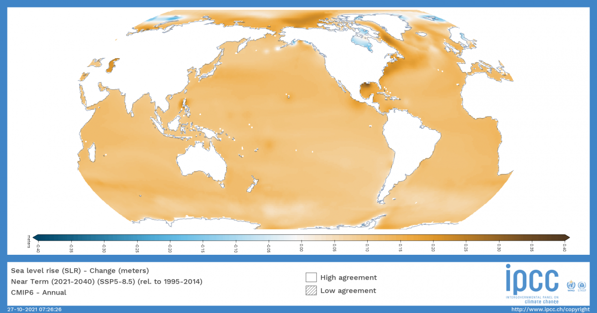
Since the Interactive Atlas is a tool to support the Atlas chapter of the IPCC, it was subjected to the same level of scrutiny. One of the first barriers we encountered was the sheer volume of raw data handled by the Atlas, in the order of hundreds of TBs. This is caused by the high number of datasets and variables contained in the tool… and some specific features that add complexity to the data. A good example of this is the custom season feature, that lets you go beyond data for spring/summer/autumn/winter and select the range of months to focus on. This is relevant for example, to study monsoons, which exhibit variable seasons over the globe. This season feature alone multiplied by 145 the volume of data handled by the Atlas, due to the necessities of the datasets to be included.
In order to facilitate the review of the Interactive Atlas, we adopted the FAIR principles of findability, accessibility, interoperability and reusability. This translates into several points about the data themselves:
- Sources: all the data incorporated into the Interactive Atlas comes from traceable sources: CMIP & CORDEX initiatives for climate projections; ERA5, E-OBS and other datasets for historical observations; and PMIP initiative for the paleoclimatic records. To obtain the different datasets, the team at IFCA used two main sources: Copernicus Climate Data Store and ESGF.
- Reproducible post-processing the post-processing is agreed upon by the IPCC.To fit into the Interactive Atlas architecture, the dataset must undergo a series of post-processes that unify the format, coordinate systems and other aspects of the data. This pipeline was implemented using open source tools and is well documented so it is reproducible.
- Metadata standards: this post-processing is described from beginning to end using metadata standards. This is possible thanks to Metaclip, the climate metadata initiative we mentioned in the previous section.
The first step in data processing was technical, and was undertaken by the Atlas team:
- Data acquisition & preparation: all of the raw data come from trusted sources, like CMIP5 and CMIP6 climate projections, as well as regional models like CORDEX. The preparation of the datasets go beyond downloading the data from their repositories. At this stage, a special effort was made to unify the structure of the data and deal with well-known technical issues among the climate modelling community. One of those issues is for example the calendar unification: only a few Global Climate Models use a standard, gregorian calendar with 365 days per year in non-leap years, and 366 days per year in leap years. Most GCMs use a so-called “noleap” (or “365_day”) calendar, which has 365 days in every year. And some models even run on 360 day calendars, where every year has 360 days (12 months of 30 days each). This was tackled by the team at IFCA.
- Data post-processing: once that the climate datasets were downloaded and unified, it’s time for post-processing them. This includes details like interpolating the data so they fit into a common geographical grid (we used conservative mapping for this), aggregating the data into the different regions used by the Interactive Atlas, contemplating as well different temporal aggregations, and calculating some metrics. This was computed using the HPC capabilities provided by IFCA, and to handle it, we relied on CDO, Climate4R and Slurm (to manage the jobs at the supercomputing facilities).
- Data integration: the datasets at this stage were integrated into the Interactive Atlas portal, and several checks were run on visualisation and the interactivity with the different features of the tool: metadata, climate stripes, seasonal stripes, GWL plot… In addition, some specific datasets were compared to their static equivalents that were included in the Atlas Chapter of the AR6 report, to ensure consistency.
Thanks to this thorough and systematic process, the Atlas team was able to spot and mend bugs and other errors in the data, its treatment and the platform itself.
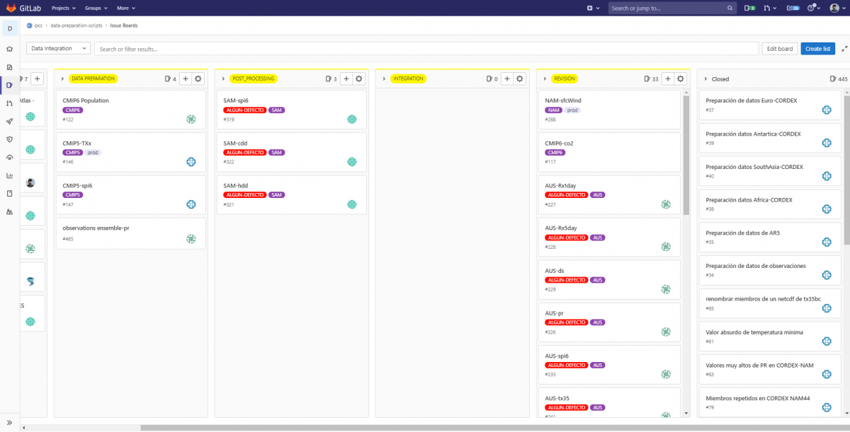
A circus with multiple stages: Gitlab integrations
This IPCC review process forced us to multiply the number of instances we had deployed of the Interactive Atlas. We ended up with four different environments: one internal, to deploy new data, functionalities, and perform the internal review; and three of them for the reviews by IPCC, experts and governments. Having so many different environments that use a common pool of data was a big lesson for us in continuous integration. We had to create a series of jobs integrated in our Gitlab, depending on what we wanted to load into which environment, and do so automatically. These comings and goings of data across different environments was a constant throughout the project. So it forced us to develop different status monitors that let us know the state of things at every moment, across the environments. In that way, we could be time-responsive, something that was crucial especially during the reviewal process by experts and governments, when the tool experienced hundreds of simultaneous visits. Of course, this was surpassed when the tool became public.
Meeting user demands and expectations: faster and robust
Once the tool became public, it had a very warm welcome: nearly 500,000 in the first week, an average response time to user queries of 1.5 seconds, and the resources load at the peak of visits was around 20% of the total. Overall, very good metrics. So, how was this achieved?
Historically, in GIS systems, usually the server was in charge of generating an image that then was served into your computer. However, as computers, mobiles and other devices have become more powerful, it has opened endless possibilities. More powerful devices meant that data can be served directly to the device in your hands, and let it do the graphical work (generating the maps instead of just loading an image. This is the case for example of web-gl and other graphical libraries. In the case of climate information, this approach cannot work: the amount of information is so huge, that the device would have to do too much work… hindering the performance. In addition to that, in the case of the Interactive Atlas, the IPCC has a global reach. And that means that the Interactive Atlas should run on all types of computers: new and old, gaming behemoths and older computers with Pentiums III. This universality principle was a guiding principle during the whole development.
So, we opted for a mixed approach:
- First the user of the Atlas selects which data to consult: dataset, variable, climate change scenario and so on.
- This generates a petition to the server that goes to the corresponding pre-calculated dataset.
- Then, the server then generates the corresponding image to show on the Atlas
This approach also enabled us to implement interesting features, like the customisable colour legend for the user: the user modifies the values of the legend, which generates a petition to the server with the new parameters, that then returns the corresponding image.
Nonetheless, this process was not as optimal and scalable as what we expected for the tool. Imagine the peak of visits at the release, when we got 13,000 visits in one hour. Every user that entered the tool is a petition to the server, that would need to generate the image and then send it. Sure, pre-calculating the datasets alleviates part of the effort. However, despite the efficiency of ADAGUC in generating images, this process still consumes resources. So, here comes the second part of the strategy: the dynamical cache (for non-technical readers: a cache is a reserved storage location that collects temporary data to help websites, browsers, and apps load faster). In our case, the server cache stores the maps that correspond to the most requested data. Of course, the first one is a given: the landing map we show when you enter the tool. But the rest of them are entirely user-driven. If a newspaper or a social media post linking to a specific view of the Interactive Atlas goes viral, the generated image is cached, and then is automatically served to the request. Thanks to this built-in strategy, the Interactive Atlas cannot die of popularity, by avoiding generating images that are popular over and over again.
Overall these are the technical details supporting the Interactive Atlas, that are behind the swift user experience it provides. Of course, another part for that lies within the actual UX/UI of the Interactive Atlas… but this topic deserves a blog post of its own, as this one has already become too long.