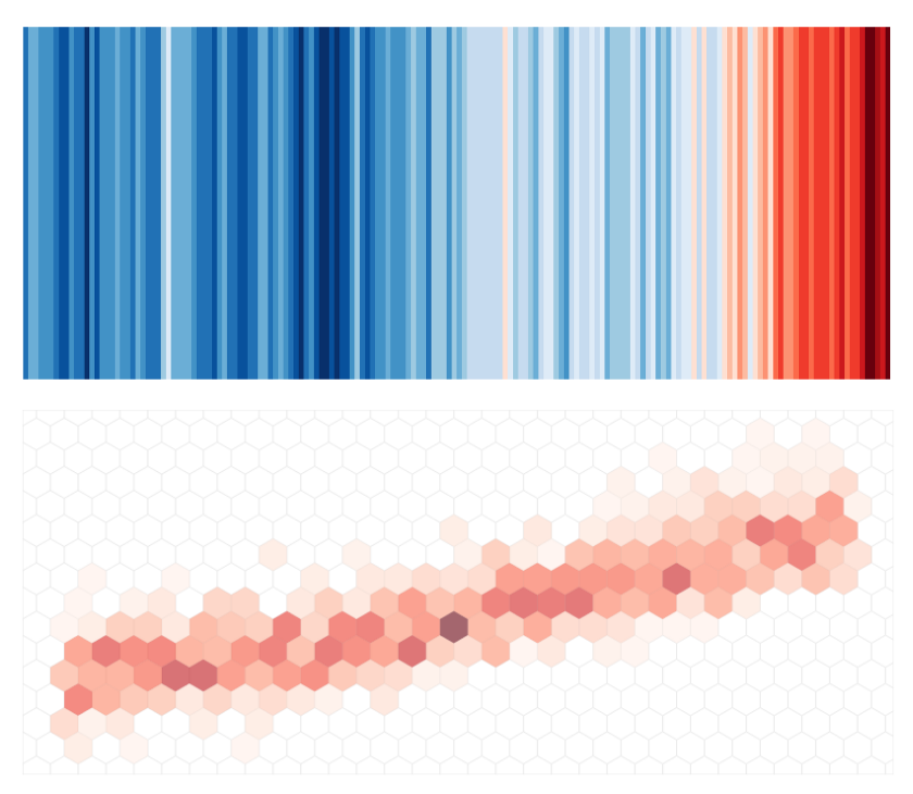
In May 2018, Ed Hawkins launched a climate visualisation that made the rounds around the world. The Climate Stripes. A strikingly simple visualisation, to convey a powerful message: the rising temperatures due to climate change. No axis, no numbers. Just colours. The intention was, as Hawkins explains, “to start conversations around climate change”1, especially with people that never talk about climate. At Predictia, we usually find ourselves in a similar position. We also develop climate visualisations, but our audience is very different from Hawkins’. Our Data Viewers and dashboards are targeted towards decision makers in different fields.
And so, we have a constant worry in our heads: how to communicate the certainty levels of climate projections. To tackle this challenge, we moved from stripes to hexagons and developed Climate Hexembles: a new visualisation of the same climate data.
This hexagonal visualisation doesn’t come out of the blue. It springs from one of our constant sources of worry: how to communicate the certainty levels of climate models. We’re far from alone in this worry. It’s widely talked about in the literature2,3,4, and we constantly see the discussion come up in different forums. Like two weeks ago at the last Climateurope webstival, where uncertainty was the main barrier identified when talking with users outside the climate community. To write about uncertainty, IPCC has come up with a neat solution5: addressing the level of confidence and likelihood of events in the text. “Global warming is likely to reach 1.5°C between 2030 and 2052 if it continues to increase at the current rate. (high confidence)”. However, to visualise certainty is a whole other question. Climate hexembles summarise this in an easy manner. The horizontal axis represents time, and the vertical one is the increase in temperature (compared with previous levels). The colour in the hexagons depict the agreement across models: the more models agree on that increase in temperature for that time period, the redder the hexagon is.
To help visualise the certainty levels of climate projections, climate hexembles follow guidelines of good practices in climate visualisation:
- Show ensemble data: rather than plotting the output of individual climate models, or show only the mean, we show the results of an array of models. This enables the viewer to explore different scenarios. Providing a full picture also makes it more difficult to cherry-pick individual models to make malintended claims.
- Stress the consensus across models: while hovering over a hexagon, you will see how many models agree on that output. This highlights the likelihood of a specific scenario in a visual way.
- Framing uncertainty: in climate communication, framing certainty levels in a positive way matters. A lot 6, 7, 8, 9, 10, 11. The phrases “Temperature will rise at least 1.3 ºC at some time between 2050 and 2060. 8 models agree on this.” and “By 2055, temperature will rise between 1.3º C and 1.5 ºC, according to 8 models.” contain the same information. However, there’s a difference on how they’re received by the audience. By putting the specific outcome first in the text, we’re framing the problem differently: the question we address is when the temperature will rise to that level, not if. And this context is provided while hovering over the hexagons in the hexembles.
See the climate hexembles in action in our showcase!
The process we followed to develop the climate stripes
Developing hex visuals was not a spur-of-the-moment, burst-of-inspiration kind of thing. It’s the result of an experimentation process, with some iterations and changes in approach, building on the expertise from previous projects we have gathered. Here are some of the things we came up with. Remember: our challenge was to tackle uncertainty. Maybe some of these approaches are useful for other ends.
If we stay on climate stripes, one way to do it would be to draw parallel stripes, compressing the information of individual models. However, this visualisation provides too much information at once, giving no rest to the eye, and rising the cognitive load of the viewer. And visually, it’s too close to a heat-map visualisation, so it is prone to confusion.
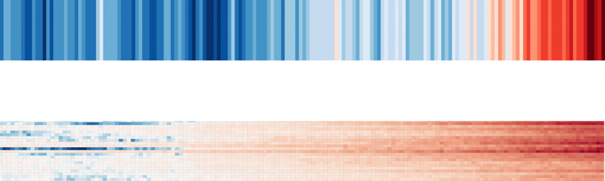
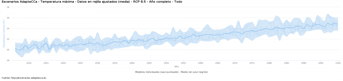
So, we switched gears, to tackle more traditional visualisations, like the time series below. These are used for example in our Climate Change Scenarios Viewer AdapteCCa, to show ensemble predictions. While they convey the message much clearer, the agreement across models is more difficult to spot at first sight. The blue shadow provides a visual range of the agreement, but highlighting the consensus across models is difficult still.
Uniting the heat-map-like feel provided by the multi-layered climate stripes with the time-series concept, we landed on the Climate Hexembles. We’re quite proud of them. Let us know what you think in the comments!
Further reading
If you found the article useful and want more information on the matter, please take a look at this external resources:
[1] Data Stories #147: Iconic Climate Visuals with Ed Hawkins Link
[2] Ho, E.H., Budescu, D.V. Climate uncertainty communication. Nat. Clim. Chang. 9, 802–803 (2019). Link
[3] Howe, L.C., MacInnis, B., Krosnick, J.A. et al. Acknowledging uncertainty impacts public acceptance of climate scientists’ predictions. Nat. Clim. Chang. 9, 863–867 (2019). Link
[4] Stanford research shows how uncertainty in scientific predictions can help and harm credibility. Link
[5] Guidance Note for Lead Authors of the IPCC Fifth Assessment Report on Consistent Treatment of Uncertainties Link
[6] Ballard, T., Lewandowsky, S. When, not if: the inescapability of an uncertain climate future. Phil. Trans. of the RoySoc A. Link
[7] The Uncertainty Handbook. A practical guide for science communicators. Link
[8] Markowitz, E.M., and Shariff, A.F. (2012). Climate change and moral judgement. Nature Climate Change 2, 243–247. Link
[9] Lench, H.C., Smallman, R., Darbor, K. and Bench, S. (2014). Motivated perception of probabilistic information. Cognition 133, 429–442. 21. Link
[10] Harris, A., Corner, A. and Hahn, U. (2009). Estimating the probability of negative events. Cognition 110, 51–64. 22. Link
[11] Epper, T., Fehr-Duda, H.and Bruhin, A. (2011). Viewing the future through a warped lens: Why uncertainty generates hyperbolic discounting. Journal of Risk & Uncertainty 43, 169-203. Link